Our much-loved high street shop Zara changed its logo, and to be quite honest with you, things are a little confusing right now.
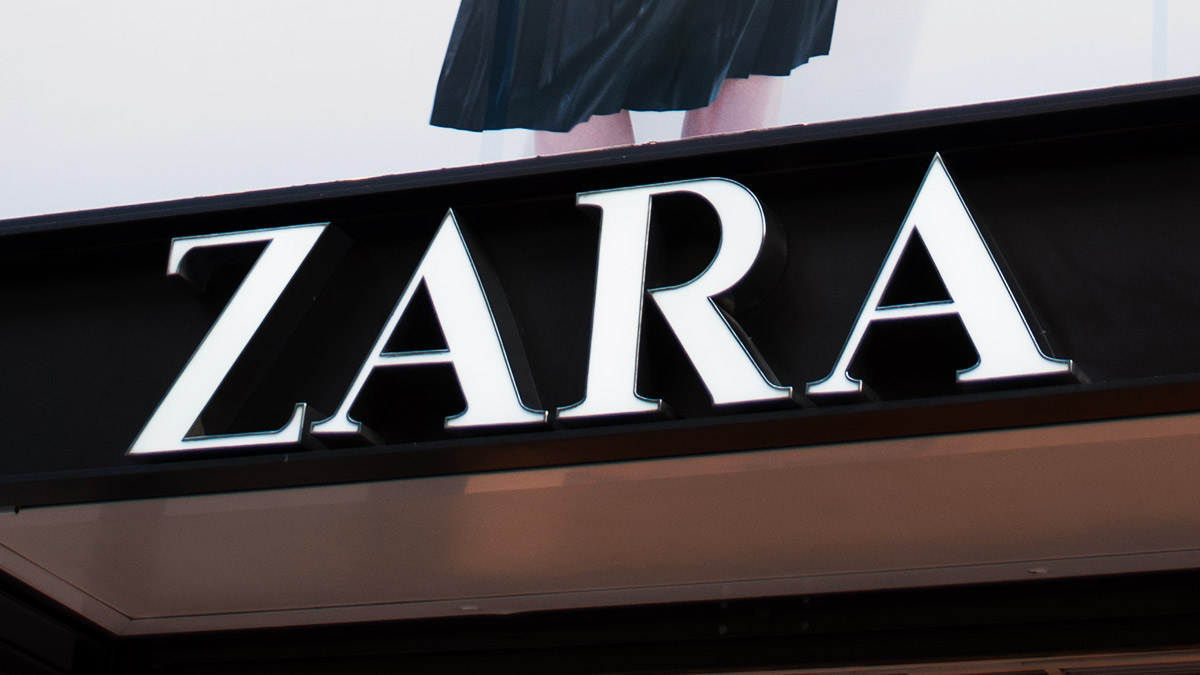
The retailer revealed the new, curvy-typeface logo on its social media accounts—and it's very different to the old one.
While we're used to seeing bold, wide letters, the new version—designed by the Baron & Baron agency—sees them much closer together, and with a curvier font.
And it appears that not everyone is impressed with the update. Social media users were quick to turn the moment into a meme:
Zara actually changed its logo for the first time back in 2010, but the alterations were small, so customers weren't quite so shocked back then.
While the social media have all been changed, it's currently unclear when store signage will be updated—which I guess gives us plenty of time to get used to the new version.
The store is trying out plenty of new things right now; last month, they launched their first-ever makeup line, which debuted with a selection of matte lip products.
Zara has said their new cosmetics venture aims to bring "top quality, innovative, fun and oh-so affordable products." But, if lip products aren't really your thing, don't panic. The brand called their "initial launch," which we're hoping means there is plenty more to come.
All change at Zara then? (P.S. Please keep the clothes the same).
Follow Abbi on Twitter.
***
This article originally appeared on Cosmopolitan.com/uk. Minor edits have been made by the Cosmo.ph editors.